Sunday, July 31, 2011
Thursday, July 28, 2011
Monday, July 25, 2011
KZN Philarmonic - Gala Concert
The National Arts Festival one of the world’s three biggest arts gatherings attracted just over 180 000 visitors to the 2010 National Arts Festival, sponsored by Standard Bank, The Eastern Cape Government, The National Arts Council, The National Lottery Distribution Trust Fund, The Sunday Independent and M-Net.
The KwaZulu-Natal Philharmonic Orchestra will be traveling to Grahamstown, Eastern Cape in June 2011 to take part in the Festival, which runs from 30th June to 10th July as part of a three year agreement that will see the orchestra perform at the National Arts Festival for the next three festivals.
Founded in 1982 based in Durban, the KwaZulu-Natal Philharmonic Orchestra is one of South Africa`s leading Philharmonic Orchestras dedicated to building new audiences for serious and popular music. Aspiring musicians will be given opportunities to engage and learn from professional musicians through workshops that will be included in the 2011 National Arts Festival’s education programmes.
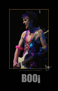
Boo the band - Grahamstown National Arts Festival 2011
Boo! entered the South African music scene in October 1997, with their mind-bendingly weird, though deliciously consumable sound. The band describes their music as "Monki Punk", because it breaks away from the usual combination of bass, drums and guitar, and substitutes the guitar with brass and keyboard sounds.
But this anarchy is not born out of anger, it is born out of a self-asserted freedom to express and expose different and conflicting human emotions. The message is one of rejoicing in the deep multiplicity of human nature.
Boo! consists of three members. The genderless phenomenon, Miss Chris Chameleon, is the bass player, lead vocalist, and writes all the music and lyrics. Princess Leonie provides extremely unconventional, yet wildly rocking beats on the drums. The blonde bombshell, Ampie Omo, produces the rest of the colorful spectrum of sounds on his trumpet, trombone, keyboard and percussion instruments.
Book sleeve
Book cover from a book I am editing, some of the togs have dropped off but about 50% of the way through.
Chicago Poster
The brilliant broadway piece performed by one of our local High School, Chicago is a musical set in Prohibition-era Chicago. The music is by John Kander with lyrics by Fred Ebb and a book by Ebb and Bob Fosse.
The story is a satire on corruption in the administration of criminal justice and the concept of the "celebrity criminal". The musical is based on a 1926 play of the same name by reporter Maurine Dallas Watkins about actual criminals and crimes she reported on.
The story is a satire on corruption in the administration of criminal justice and the concept of the "celebrity criminal". The musical is based on a 1926 play of the same name by reporter Maurine Dallas Watkins about actual criminals and crimes she reported on.
Sunday, July 24, 2011
Saturday, July 23, 2011
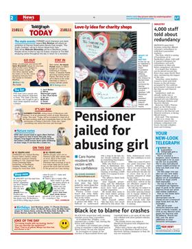
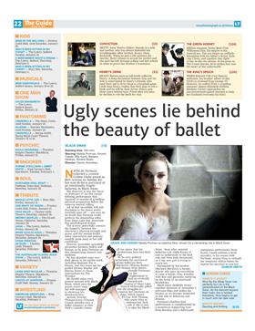
Earlier profile page high-lighting my work
This was the cover for a supplement in the local news vender, well when it was a real newspaper anyway. Professor Gavin Stewart was the editor and he was fircely proud of quality copy andprofessional journalists who produced real news.
Wednesday, July 20, 2011
What Type Of Newspaper Are You?
What Type Of Newspaper Are You?

A day before ST’s latest redesign launch, the typeface for its masthead was changed from Popular (only shred of it left is in ‘THE’) to Big Caslon, said Peter Thomas Williams who was part of the redesign team. While Popular failed to live up to its name, because it was thought to be “western” and “old-looking”, Peter, who is also design editor of my paper, said that the biggest factor when he chooses typefaces in his eight years of working in Singapore Press Holdings (SPH), is actually cost.
While he declined to go into specifics, one can do the math based on price lists online. Purchasing one typeface like Big Caslon for use on up to 1000 computers would already cost more than S$5,000. Considering the ST redesign itself involved about four typefaces, multiply that to the cost of installation for more than a thousand computers in SPH and one begins to see how cost becomes a major factor in his typeface choices.
It was on such an “extreme budget” that led Peter, who used to work in a design consultancy in Ireland and as a visual communications lecturer in South Africa, to draw the nameplate of SPH’s Indian diaspora newspaper, Tabla, instead of purchasing a typeface. This was based on three different typefaces: Popular and Calvert for Tabla and the exclamation mark from Bauer Bodoni, which he felt looked like the Indian architectural style.
Costs aside, another important factor is the amount of space a typeface takes up, especially for use as body copy. If it is designed for newspaper use, a typeface is usually efficient in its space management, having a shorter x- and y- height (think shorter x and y and applied to all 26 letters) and kerning (space between letters) is even. A typeface that takes up too much space would mean story lengths have to be shortened to keep the same amount of news on a page. “If you choose a typeface that is beautiful but it is knocking off four paragraphs, it is useless.” he said.
A final factor in choosing a newspaper typeface is how intricate it is as newspapers are printed on paper quality that is “like toilet paper”. Thus, a font with intricate serfis would not come out looking good as the ink is likely to seep causing such details to be lost.
—
In the next part of this interview, The Paginator asks Peter how it was like redesigning ST twice, The Sunday Times and My Paper.
CREDIT: http://thepaginator.wordpress.com/2009/02/09/what-type-of-newspaper-are-you/
Redesigning newspapers and why it matters
One point, or approximately 0.04 cm, was all it took for readers to find the recently redesigned Sunday Times a comfortable read again. After its redesign in April 2008, several readers complained that it was hard to read the paper’s body copy so designer Peter Thomas Williams increased its leading (amount of space between lines of text) from 11 point to 12 point and to his delight, the week after, a reader sent in an e-mail saying it was much easier to read it.
This is why Peter, who has redesigned ST (twice), The Sunday Times and designed tabla! and my paper, starts every project by working on the typography of its body copy. My Paper proved a challenge for the Irish because he had to design a newspaper that incorporated both the English and Chinese language. He did this by using similar colours and grid system, and picking matching typefaces that unified the disparate languages on to one paper.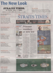 While he says that “proper” redesigns usually take up to a year, the recent ST redesign was done in six months, partly to coincide with the launch of ST’s new video news platform Razor TV. A redesign should not be rushed because it is not just a matter of deciding on a new look but it takes time to introduce it to the sub-editors and into the computer systems, “You can’t just redesign a newspaper and walk away, the hard part is implementing it down the line.” he said.
But didn’t ST redesign in 2004? Peter said that newspapers today redesign every 2 to 3 years in an effort to stay relevant to its readers. In fact, in the most recent redesign, they considered reducing the nameplate to just “ST” because it was known to most of its readers as that.
On a daily basis, one of the biggest challenge in designing a page is working around advertisements says Peter, “The less ads the more beautiful your pages are going to be… SPH (papers) are full of ads.”. He pointed out that the winning designs awarded annually by the Society of News Design rarely have any advertisements on them, but the design editor of my paper is realistic, “That’s where we get our bonuses and your paycheck, so we can’t really complain that much.”
Content v design: Or why judging a newspaper by its new front page isn’t very fair
The newspaper I did most of my training on, and spent five years working on during two spells, unveiled a new look on Friday. It hit the streets at 7am. By 10am, Roy Greenslade had delivered a withering verdict on the redesign.
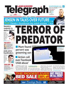
I hate to rain on the Telegraph’s parade, but the sight of this “new” front page is hardly encouraging. The predictable choice of splash and its presentation suggests to me a major reason for the decline in popularity of regional (and local) newspapers.I realise that concerns about the grooming of young girls is a topical story, especially in certain towns in Lancashire. But the tabloid-style treatment is surely inappropriate in a paper that is supposed to appeal to a wide cross-section of the residents of Blackburn, Burnley and their hinterlands.Why should a regional papers think a huge sans headline over a crime story with very little text is “modern” and exciting? Then there is the inevitable celebrity content.
It’s not bad going to have either got up from London to review the edition or to have arranged with Newsquest, not the most talkative of newspaper publishers, to have a copy sent to him for an early critique. That is, of course, assuming Greenslade – whose blog I enjoy reading, even if I don’t always agree with it – has seen the entire edition and not just the small images posted on the Lancashire Telegraph website to accompany the announcement about the relaunch.
For what it’s worth – and I’m certainly not a design expert – I disagree with Prof Greenslade’s assessment of the new-look Lancashire Telegraph. The reason I disagree isn’t based on any journalistic insight but on the fact that when I went into my local Tesco, which sells three daily regional newspapers, the Telegraph stood out much more than usual.
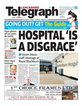
My local Tesco sells both editions of the Lancashire Telegraph and I tend to read the Blackburn edition, not the Burnley edition, which is the one Greenslade draws his conclusions from. Yes, the new design is very tabloid, but it’s also very busy, selling very hard the content inside. The Blackburn edition led on a hospital staff survey it had got its hands on – a worrying read for anyone who goes to the hospital, and the latest in a catalogue of bad news stories from the local hospital trust.
The splash on the Burnley edition which Greenslade refers to was headlined ‘Terror of Predator’ and was an interview with a mum who discovered a man was grooming her teenaged son online via Facebook. It’s a good read and isn’t what I’d call predictable. To that end, Greenslade’s suggestion ‘I realise that concerns about the grooming of young girls is a topical story, especially in certain towns in Lancashire‘ doesn’t really make sense, as it was teenage boy being groomed via Facebook. The topicality of grooming of young girls is something the Lancashire Telegraph has led on for several years – Jack Straw’s recent comments about Pakistani gangs may have caused a surprise nationally, but the Telegraph played a big part in raising the issue and drawing attention to it four years ago – and work with the police to tackle it too.
So the main argument from Greenslade appears to be that tabloid design is in part to blame for the decline of regional newspapers, along with the tabloid treatment they give to stories. If anything, I think the industry is guilty of putting too much emphasis on design. We can all name newspapers which are very poor on design but which enjoy considerable success.
Will a reader really refuse to buy a paper because the headline is a little too full on? Having covered some very high-profile stories in the Ribble Valley – the poshest part of the Telegraph’s patch – which were given a tabloid treatment and still contributed strong sales days, I suggest the answer is no.
That leads me to the conclusion that it’s content which counts. In the case of the Lancashire Telegraph, it’s the only product providing a daily news and sports mix which caters for East Lancashire.
It does so, like every other regional newspaper, in an era where the loyal, six-day-a-week reader is harder to come by. This is, in part, due to the decline of the newsagent. Supermarkets play a massive part in the success or failure of circulation strategies now and newspapers need to grab attention quickly – and that’s what the Telegraph’s new design does. Regional newspapers have to shout to show what they’ve got, or do something which makes the passing customer stop and take note.
Steve Dyson, the former Birmingham Mail editor, is a massive fan of the Lancashire Telegraph – he praised it last year for editionising so heavily (something which was at times a considerable chore when working on the LET – as it was then – newsdesk). It tries to get as local as possible and get as much in as possible, and the inside pages, in my opinion, combine high story counts without sacrificing design. It applies that principle to the front page too – providing as many reasons to buy the paper as possible.
Greenslade also argues that the paper shouldn’t be promoting a film review of Black Swan, claiming:
“Why should the people of Bacup, Darwen and Oswaldtwistle be especially interested in the movie Black Swan? That’s a national, not a regional, feature.”
Here’s a thought: We have cinemas in East Lancashire, too. In fact, in recent years, two new multiplexes have opened. Cinema going is a major past-time in the area, so it figures that promoting a film review is a sensible thing to do.
Greenslade concludes by saying:
Of course, it’s foolish to compare that figure to the Evening Telegraph’s sales during my time as a sub there (under the wonderful Harry Childs – anyone else remember him?) in 1967-8. Even so, we must have been doing something right with our much more sober editorial approach in those days.
Yes, the only thing which was different back in 1967 in East Lancashire was the more sobre approach the Evening Telegraph took to its news coverage. Changing consumer habits, more transisent communities, greater availability of news … none of those have had any impact at all. Life here really is just like the whimsical view of the north delivered by The Guardian’s Northerner column on a regular basis. Such an argument would have currency if those papers which do look very similar to their 1960s counterparts in look and tone were as popular as ever, but that simply isn’t true.
I agree with Roy that a redesign alone won’t reverse a circulation decline – but if it helps draw attention from the lapsed reader and facilitates higher story count and the ability to deliver the content readers want, then it certainly can’t hurt. And I say that as someone who has bought and read the whole paper.
Tuesday, July 19, 2011
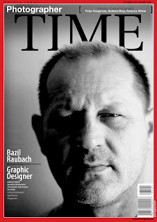
My professional profiles
As a result in a change in my financial position, I have had to update my CV,
professional profiles and thank goodness I have a huge depth of work to dip into and put these profiles together.
Subscribe to:
Posts (Atom)


